On Saturday, September 7th, 2019, my grandmother and I drove up to the Brandywine River Museum of Art for a class project. During this trip, we took the time to explore the different levels of the museum and the trails around the grounds. By the end of the trip, I came back with plenty of photos and two new books for my collection.
Questions:

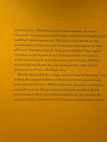
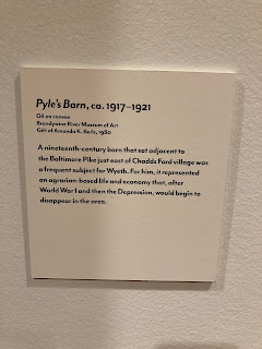
2. Select an illustration (make sure it is an illustration piece and not a fine art painting) from the collection in the Museum that has the most impact on you and tell why? Take a photo of it if you are permitted. Be sure to note the following:
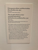
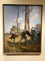 Artist: N.C. Wyeth
 Medium: Oil on Canvas Size: Not Mentioned
Year of Creation: 1917
The illustrations featured here were created for the book, The Boy's King Arthur.
The reason I chose these two illustrations is that I really love the subject manner of the illustrations. The knights of old and fantasy worlds are always something I can dive into. When walking in the gallery, there was just something that pulled me to these two pieces in particular. The colors were so vibrant and the figures felt so alive. After reading the plack, it was fun to learn that N.C. Wyeth had been experimenting with his scenery for this set of illustrations. This is also one of the two books that I bought for my shelves.
3. Overall how would you describe the compositions of the piece you selected in question 2
The composition of both illustrations makes the viewer feel like they are an onlooker into the scenes that are occurring within the picture. In the picture to the left, the tree that separates the viewer from the mounted knight pushes that figure into the midground. By having the rider and horse angled away from the viewer as well, this creates a feeling of depth in the illustration. The top of the tree also creates a top border because of how the leaves curve and help to manipulate the center point back to the hornblower.
The piece on the right is left open in the foreground leaving the viewer to have a front-row seat to the ongoing battle. The main point of attention for the illustration is the figure with his back to the viewer. Both the group of knights to the right and the charging one to the left help to direct the action back onto this figure.
4. How would you describe the color pallet and tell why it was effective the piece you selected in question 2
The color pallets of the two illustrations are bright and vibrant. This is effective since the illustrations were for a retelling of the legends that involve King Arthur and the Knights of the Round Table. These legends are supposed to be inspiring and tell of the glory that surrounded this group of noblemen.
5. What is the Brandywine School of American Illustration and what illustrators were part of this group? Name the illustrators and the pieces you were able to see in
the museum.
The Brandywine School of American Illustration was a summer program that was taught by past Drexel Professor, Howard Pyle. He opened the school in Chadds Ford PA between the years 1898 and 1903. Through this school, Howard Pyle taught over 150 different artists in the skill of illustration. Some of his students were John Wolcott Adams, Stanley Arthurs, Harvey Dunn, Walter Everett, Elizabeth Shippen Green, Thornton Oakley, Violet Oakley, Frank Schoonover, Jessie Willcox Smith, and N.C. Wyeth.


6. What have you learned from visiting the museum that pertains to the course?
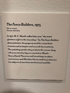
When walking around the trails at the property and in the museum, I read a plack that said what the goal of preserving the property was. It was to help keep inspiring artistic creation through the sheer beauty of nature for future generations. The artists who studied on the property seemed to draw a lot of their inspiration for nature itself. One if N.C. Wyeth's works depict men putting up a fence. I remember that the little information plate next to the piece said that this was one of the most beautiful things Wyeth had seen within the town. After being on the property and walking around the place, I can see why so many awesome artists and pieces were developed from that location. Inspiration for a piece can come from anywhere. Either from nature to a dream.

When walking around the trails at the property and in the museum, I read a plack that said what the goal of preserving the property was. It was to help keep inspiring artistic creation through the sheer beauty of nature for future generations. The artists who studied on the property seemed to draw a lot of their inspiration for nature itself. One if N.C. Wyeth's works depict men putting up a fence. I remember that the little information plate next to the piece said that this was one of the most beautiful things Wyeth had seen within the town. After being on the property and walking around the place, I can see why so many awesome artists and pieces were developed from that location. Inspiration for a piece can come from anywhere. Either from nature to a dream.
